Introduction to Drafting
This is aimed at helping students understand the basic skills of drafting
What is the objective?
When drawing plans, we have a few tools at our disposal to convey the information. We have the instructive and informative text. We have the line weights, opacity and styles and symbols.
Using conventions can help people within the industry quickly ascertain what is happening on your plan.
Session Outline
What is the objective?
Line weights
Titleblocks
Page Layout
Lettering
Aspect
Dimensioning
Line Weights
Line weights are used to create hierarchy in drawings and give definition. Different line weights can be shorthand to help discern heights, importance, stacking order and depth.

Example of a line weight hierarchy

Some Rules to follow (Some of the time)
Proximity - The closer something is to the viewer the thicker the line weight should be:
In Plan View - The taller something is the thicker the line weight
In Elevation View - The closer something is to the viewer the thicker the line weight.
Use variation - Single or too few line weights will create a drawing that is lifeless and flat. Multiple line weights will create hierarchy and make your plan easier to interpret
Detail - Line work within objects should be finer than the perimeter lines.
Consistency - If you use a line weight for a particular element continue with that for the remaining instances.
Titleblocks
Titleblocks convey the supporting information needed to interpret what is on the plan. They also include contact information.

Titleblock Position
In general we keep our titleblocks to the bottom or right hand side. It is also good idea to keep important information regarding to the topic of the page in the bottom right hand corner. This allows people to quickly flick through a set of drawings to find the relevant one.
What to include
Project Information
Site Address:
Client (Privacy):
Project Name:
Your Information
Drawn by: Initials are fine
Checked by: Initials are fine
Address:
Name of Business:
Logo:
Email:
Phone Number:
Website:
About the Page
Scale (If only one drawing):
Page Size:
Issue No and Date:
Revision No and Date:
Aspect (not necessarily in TB):
Drawing Name (if only one):
Status (e.g. Draft):
Date Drawn:
Page number (e.g. 1 of 5):
Copyright Info:
Reason Drawing was Submitted: e.g.
Construction, Conceptual design, Tender
Page Layout
When on the computer we can simply draft what needs to be included then choose a page size at the end and arrange. When hand drafting, we need to think a little more about where things go before we start.
Negative space
Make sure you give your drawings space to breathe. Having so white space around them helps give definition and makes their reading more relaxing.
What else is to be included
Do you have elevations or sections to include? Do you need a detail or specifications note? How big will the legend be? How much of the real-estate is your titleblock going to take up?
How big will your main drawing be
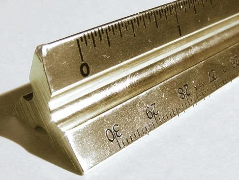
You can estimate the space that your drawing will take up by looking at the longest measurements (probably the perimeter of your site) and using a scale ruler move this around your page until you have it in a position you like.
Page size
After taking into consideration all the information that needs to be included on the page you should now be able to choose a paper size that will accommodate it. It is best if you stay on the same size paper throughout the process, so if you can think forward to the future outputs at this point it is a good idea.
Lettering
Lettering by hand is an artform. Usually we stick to uppercase only as it is easier to make legible. When on the computer I generally use a mix of lower and uppercase as it flows better. However, a lot of businesses have continued with uppercase only even after transitioning to drafting on the computer.
Some people no their limitations with the pen and will scan their drawings to then annotate on the computer. This could be a very sensible workflow as it is very easy to ruin a drawing with bad handwriting.
Hand Lettering
Stick to uppercase
Standard Text - 3-4mm in height with 2mm spacing between lines
Headings - 5-6mm in height
Lines - Rule lines as guides in pencil and then erase them once complete

Aspect
Where is north on your project? Ideally we would have north pointing directly up. However sites aren’t often orientated like this but we can insure that north is not down on our page.

Examples of North arrows from LayOut for SketchUp